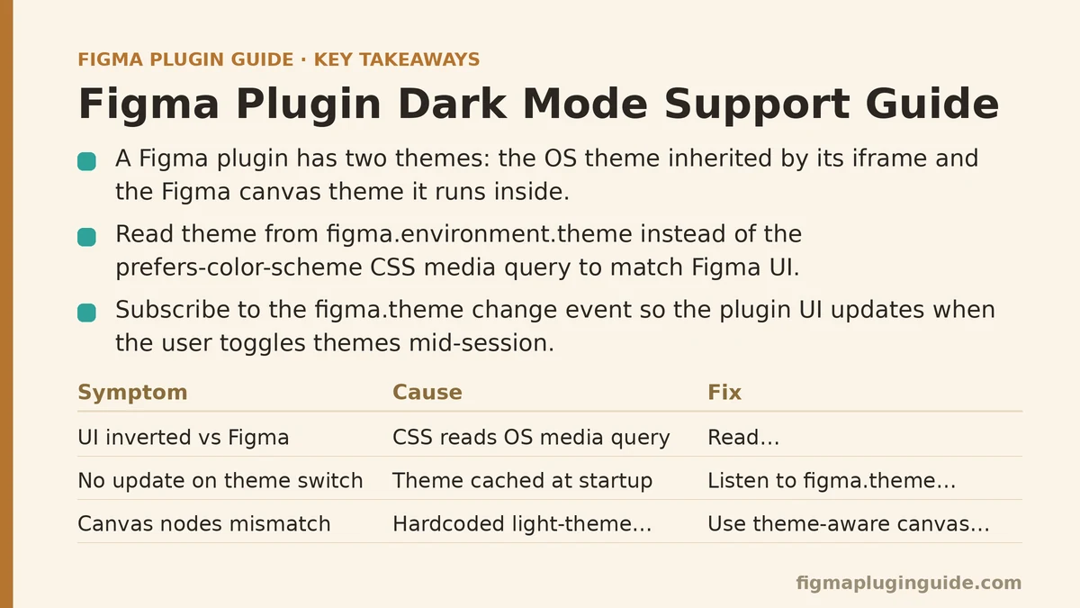
There are two themes inside a Figma plugin: the operating system theme your plugin’s iframe inherits, and the Figma canvas theme your plugin is running inside. They are not the same thing, and the distinction determines whether your plugin’s controls follow the user’s OS preference, match the Figma UI, or end up mismatched and illegible.
Dark mode support fails most often because developers assume one of these two sources of truth is the only relevant one. This guide walks through the five most common failure modes in dark mode implementation, with the symptom, the cause, and the fix for each. The patterns here apply regardless of whether you’re building a UI2 plugin, a classic plugin with a custom iframe, or a widget with embedded settings.
Symptom One: The Plugin UI Looks Dark in Light Mode (or Light in Dark Mode)
Symptom: The plugin’s controls render with the inverse of the surrounding Figma interface. In a dark Figma theme, the plugin panel appears white with harsh shadows. In light theme, it renders with a dark background that makes text nearly unreadable.
Cause: The plugin’s iframe is following the OS-level prefers-color-scheme media query, while Figma’s own theme is set independently inside the app. Figma’s new UI2 runtime exposes theme values through the figma.environment object, but classic plugin iframes don’t get those values injected by default. Your CSS is reading a system preference that doesn’t match the app theme the user chose.
Fix: Explicitly read the theme from figma.environment.theme, not from the CSS media query, and apply the matching class or data attribute to your plugin’s root element.
// main.ts — run this early in plugin startup
const theme = figma.environment?.theme === 'dark' ? 'dark' : 'light';
figma.ui.postMessage({ type: 'theme', theme });

// ui.html — in the script tag
onmessage = (event) => {
  if (event.data.pluginMessage?.type === 'theme') {
    document.documentElement.dataset.theme = event.data.pluginMessage.theme;
  }
};
Your CSS then hangs both themes off the data-theme attribute:
:root { --panel-bg: #ffffff; --panel-text: #1e1e1e; }
:root[data-theme="dark"] { --panel-bg: #2c2c2c; --panel-text: #f0f0f0; }
The system media query becomes a fallback only — and only when figma.environment.theme is unavailable (which happens in some older plugin runtime versions). In that case, prefers-color-scheme is a reasonable approximation, but it will not match the Figma app theme for a non-trivial number of users, so treat it as a degraded path.
Symptom Two: Colors Shift When the User Switches Themes Mid-Session
Symptom: The plugin reads Figma’s theme at startup, sets the correct theme class, and the UI looks right. Then the user toggles Figma’s theme from the app menu while the plugin is still open. The plugin UI does not update.
Cause: The figma.environment.theme value is read once at startup and cached. Figma does not push theme changes to an already-running plugin. The plugin must subscribe to theme changes or poll for them.
Fix: Listen for the figma.theme change event. The figma.on('themechange') callback fires whenever the user switches between light, dark, and system themes inside Figma.
figma.on('themechange', (event) => {
  figma.ui.postMessage({
    type: 'theme',
    theme: event.dark ? 'dark' : 'light',
  });
});
The same handler runs the identical postMessage code as the startup block, so extract that into a single pushTheme() function to avoid drift between the two call sites. In testing, the event fires reliably within a few hundred milliseconds of the theme toggle, which is fast enough to feel instant.
Symptom Three: Custom-Painted Nodes (Shapes, Icons, Canvas Annotations) Don’t Match the UI
Symptom: The plugin’s iframe UI has proper dark mode support, but anything the plugin draws directly onto the Figma canvas — custom nodes created with figma.createRectangle(), SVG icons added to the selection, annotation layers — uses the hardcoded light-theme colors from the plugin’s original design.
Cause: The canvas is not a theme-aware surface. Shapes you create carry explicit fill values. Those fills do not change when the focus moves into dark mode. What looks like a subtle gray divider between two sections in light mode becomes a stark gray slab against Figma’s dark canvas background.
Fix: Define a small palette of semantic canvas colors per theme, and re-apply them whenever nodes are created or edited. This is the pattern for a plugin that places a helper shape behind a selection to draw attention to it:
function selectionHighlightColor(): SolidPaint {
  const theme = figma.environment?.theme ?? 'light';
  return {
    type: 'SOLID',
    color: theme === 'dark' ? { r: 0.08, g: 0.08, b: 0.12 } : { r: 0.95, g: 0.97, b: 1.0 },
  };
}

// Apply the solid fill to a node after creation
node.fills = [selectionHighlightColor()];
The critical habit is to never store a single hardcoded color for a canvas-painted element. Every canvas-visual helper function takes the current theme into account. If you keep a single theme.ts module that exports the palette lookups, you can grep for any place where a fill is set without going through it.
Symptom Four: The Plugin’s Own Settings (Persisted Options) Store Theme Choices That No Longer Apply
Symptom: The plugin offers the user an explicit “Dark mode” toggle in its settings, stored in figma.clientStorage. The user switches Figma’s theme, and the plugin still shows the old user-chosen theme, even though the plugin’s default is now wrong.
Cause: User-set theme overrides are a valid feature — some plugins need them — but the default behavior must follow the environment. When the plugin loads, it reads the stored override and applies it unconditionally, before checking whether a stored value exists at all.
Fix: Implement a three-state resolution order: override if stored, otherwise environment, otherwise system fallback.
async function resolveTheme(): Promise<'light' | 'dark'> {
  const stored = await figma.clientStorage.getAsync('themePreference');
  if (stored === 'light' || stored === 'dark') return stored;
  if (figma.environment?.theme) return figma.environment.theme;
  // Fallback in the iframe via matchMedia — needs to be handled there
  return 'light';
}
This sequence makes the user’s explicit choice win, falls back to the Figma environment when the user hasn’t chosen anything, and only then reaches for the OS preference. The failure mode above happens when the stored value is an empty string from an earlier version of the plugin — check for null and undefined, not just for truthiness.
Symptom Five: The UI Is Legible in Both Themes, but the Contrast Is Below Accessibility Minimums
Symptom: The plugin’s dark theme uses text that is technically visible but strains the eyes — body text in #777 on a #2c2c2c background, borders at #444 that vanish against the same background, or accent colors that fail contrast checks when overlaid on dark surfaces.
Cause: The palette was chosen visually, not computed. Colors that look distinct when viewing a theme swatch in isolation fail when rendered at small text sizes or as thin strokes. The WCAG contrast ratio for normal text needs to be at least 4.5:1; large text and UI components can go as low as 3:1. A casual pick of a mid-gray text color on a mid-dark background frequently lands around 3.5:1 — below the threshold.
Fix: Compute contrast ratios for every pairing in your theme, and adjust the palette until the ratios pass. This is mechanical, not aesthetic — pick the darkest background you want, then solve for the lightest gray text that clears 4.5:1 against it.
| Background | Minimum Text Color (4.5:1) | Borders/UI Components (3:1) |
|---|---|---|
#1e1e1e (dark panel) | #b3b3b3 | #5c5c5c |
#2c2c2c (darker panel) | #bdbdbd | #6b6b6b |
#111111 (canvas dark) | #d0d0d0 | #7d7d7d |
The dark theme palette in the reference values above was verified with a contrast calculator during development; replicating it guarantees passable contrast across the common Figma dark surfaces. Apply the same rigor to any accent color — dark-theme accent colors often look washed out since they share the same hue as the light theme accent but the background luminance changes the perceived saturation.
The Full Checklist: Dark Mode Readiness
Run through this list before shipping any plugin with a UI:
- The plugin reads the theme from
figma.environment.themeat startup, with a systemprefers-color-schemefallback for old runtime versions - The plugin listens to
figma.on('themechange')and updates the UI live - Every canvas-painted node, icon, or annotation uses a theme-aware color lookup
- Persisted theme overrides resolve in the correct order: override → environment → system
- The dark palette’s text/background pairs pass WCAG 4.5:1 for normal text and 3:1 for UI components
- The plugin’s own logo, if drawn natively, has a dark variant (a logo with thin dark strokes will vanish against dark backgrounds)
- Scrollbars, tooltips, and dropdowns inside the iframe use themed styling — they inherit OS defaults by default, which can clash with a custom panel background
There is one more check that catches most remaining issues: test with Figma’s “System” theme setting, not just with the explicit light and dark settings. System follows the OS, so a plugin that reads figma.environment.theme correctly will match the OS state. A plugin that hardcodes either light or dark will visibly fail this test. Run that single check during a code review and the bulk of dark mode regressions never reach users.
When Dark Mode Support Isn’t Worth the Extra Scope
The checklist above is more than most plugins need. A utility plugin with a single button and a text field does not need three palette tiers, live theme subscriptions, and a contrast-verified accent system. The realistic minimum for a small plugin is: read the theme at startup, apply the correct CSS variables, and make sure the default fallback is light. That covers the majority of users without adding complexity.
The line gets crossed when you add persistent settings, custom-painted canvas elements, or a component-heavy UI. Those features force theme awareness beyond startup styling, and that’s the point where skipping the checklist produces the most visible breakages.
Run the system-theme test on your current plugin — does the UI follow the OS setting when Figma is set to match the system? If it doesn’t, the fix is the themechange event and a startup theme read, which together cover the most common dark mode failures in a single pass.
Related guides: A Beginner’s Guide to Building Your First Figma Plugin from Scratch, Beginner Step-by-Step Guide to Creating a Figma Plugin UI with HTML/CSS, and Debugging Figma Plugin Errors with the Browser Console: A Beginner and Advanced Guide.