Say you are trying to ship a component that matches the design exactly, and the engineer on the other end of the file has a Figma link with a frame called Hero / Final / v3 (USE THIS ONE). You open it, inspect a button, and see padding: 13px on the top and padding: 15px on the bottom. The text color is #1A1A1A in one instance and #1A1A19 in another. The corner radius is 7.5, which is not a value anywhere in the token set. Nothing is broken enough to block you, but every value requires a decision, and decisions require a Slack thread, and the Slack thread is now the real handoff.
This post is organized as a myth-vs-reality comparison because most handoff advice repeats claims that sound reasonable and fail under real constraints. Each section names a common belief, describes what happens instead, and gives the mechanism that prevents the failure.
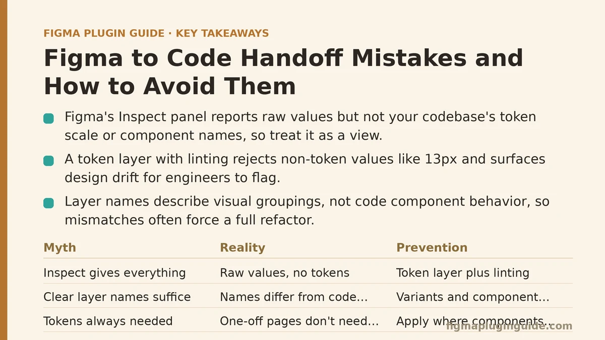
Myth 1: “The dev tools panel gives engineers everything they need”
Reality: The Inspect panel reports raw values as authored in Figma. It does not know what your codebase’s spacing scale is, which values are intentional and which are drift, or what the component is called in the design system’s code layer.
A frame that has been edited by four people over three months accumulates values that were never decisions: 13px, 15px, 7.5px, #1A1A19. Inspect faithfully reports all of them. An engineer reading the panel either copies the raw numbers (introducing hardcoded magic values into the codebase) or stops to ask about each one (spending review time on arithmetic instead of behavior).
The panel is a view, not a contract. Treating it as the source of truth means the source of truth is whatever the last person dragged.
What prevents it
A token layer that maps every design value to a named variable, and a linting step that rejects values outside it. In practice this means publishing variables through Figma’s Variables API or an equivalent tokens pipeline, then enforcing in code that spacing and color come from named constants:
// tokens.ts — generated or hand-maintained from the design token source
export const space = {
  xs: '4px',
  sm: '8px',
  md: '12px',
  lg: '16px',
  xl: '24px',
  '2xl': '32px',
};

export const color = {
  textPrimary: '#1A1A1A',
  textSecondary: '#6B6B6B',
  surface: '#FFFFFF',
};

// component usage
const Hero = styled.section`
  padding: ${space['2xl']} ${space.lg};
  color: ${color.textPrimary};
`;
With this in place, 13px cannot be expressed. The engineer either uses space.md (12px) or space.lg (16px) and raises a flag if neither matches. That flag is the useful signal — it means the design has drifted, not that the code is wrong.
When NOT to do this: A one-off marketing landing page that will not be maintained, reused, or extended does not need a token system. Introducing one there adds ceremony without payoff. Token infrastructure pays off when the same spacing or color appears across multiple components that will be edited independently.
Myth 2: “If the designer named the layer clearly, the handoff is unambiguous”
Reality: Layer names describe visual groupings. Component names in code describe behavior, data shape, and composition. These are different things, and a layer named Card does not tell an engineer whether the code component accepts a children prop, a slots object, or a fixed set of named regions.
The tricky part is that the mismatch does not show up until implementation. An engineer sees a Card layer with an image, a title, and a body, builds a component with image, title, and body props, and then discovers three other frames where Card appears with an additional footer, a badge, or no image at all. The component interface was wrong from the start, and the fix is a refactor rather than an edit.
What prevents it
Variants and component properties should map to the code component’s API before implementation starts. Figma variant properties (state, size, hasIcon) correspond to props in most component libraries. Boolean properties correspond to booleans. Instance swap properties correspond to slot props or render props.
| Figma construct | Typical code equivalent | Common mismatch |
|---|---|---|
Variant property (size=sm/lg) | Union prop (size: 'sm' | 'lg') | Variant names use spaces or casing that break identical prop naming |
Boolean property (hasIcon) | Boolean prop (hasIcon) | Figma defaults to true; code defaults to false |
| Instance swap property | Slot prop or children | Figma swap lists a specific component; code accepts any ReactNode |
| Text property | string prop | Figma allows multiline by default; code expects single-line |
| Nested variant set | Sub-component composition | Flattening in Figma hides the composition the code needs |
Naming the Figma property size with values sm and lg means the code prop can be size: 'sm' | 'lg' without translation. Naming it Size Option with values Small and Large means every implementation adds a mapping function, and mapping functions drift.
Myth 3: “Redlines and annotated screenshots close the gaps that Inspect misses”
Reality: Annotations describe intent for values that were already decided. They cannot specify behavior — what happens on hover, how the component responds to a 320px viewport, whether the loading state is a skeleton or a spinner, whether the error state pushes content or overlays it.
Handoff friction clusters around behavior, not numbers. Engineers can read 16px from the panel. They cannot read “when the list exceeds 20 items, paginate instead of scrolling” from a static frame, and no redline captures it.
What prevents it
Behavior needs to be represented in the design file itself, in a form the engineer will see when they open the relevant frame. Two practices that work:
- A state matrix per component. Every interactive component gets a frame containing all its states side by side: default, hover, focus, active, disabled, loading, error, empty. If a state is missing from the matrix, it is missing from the spec, and the engineer will either guess or ask.
- A behavior note attached to the component set, not a separate doc. Figma’s description field on a component or component set is visible when the component is selected. A description that says “loading state replaces body content, keeps header and footer, no layout shift” travels with the component. A note in a separate spec doc does not.
Here is a component definition with behavior captured in a form that survives the handoff:
// Button.tsx — the state matrix in Figma has one frame per state
type ButtonProps = {
  variant: 'primary' | 'secondary' | 'ghost';
  size: 'sm' | 'md' | 'lg';
  state: 'default' | 'hover' | 'focus' | 'active' | 'disabled' | 'loading';
  children: React.ReactNode;
  onClick?: () => void;
};

export function Button({ variant, size, state, children, onClick }: ButtonProps) {
  const isDisabled = state === 'disabled' || state === 'loading';
  return (
    <button
      data-variant={variant}
      data-size={size}
      data-state={state}
      disabled={isDisabled}
      aria-busy={state === 'loading'}
      onClick={onClick}
    >
      {state === 'loading' ? <Spinner size={size} /> : children}
    </button>
  );
}
The data-state attribute is the mechanism that keeps the Figma state matrix and the code implementation aligned. Every state in the matrix must be reachable through the state prop, and every state in the prop must have a corresponding frame. If your test suite or a visual regression tool renders each state, the alignment is enforced rather than assumed.
Myth 4: “A shared token file means design and code are synchronized”
Reality: A token file is a snapshot, not a subscription. If the designer adds color.brand.accent in Figma on Tuesday and nobody regenerates the code token file, the code has no way to reference it. The failure is silent — the code compiles, the design still renders, but the accent color used in the new component does not exist.
The subtler failure is direction. Tokens flow design-to-code in most setups, but code teams sometimes introduce a token that has no design equivalent (an error state color used only in code, for example). Without a back-channel, the next design review produces a component that uses a slightly different red, and the two reds coexist.
What prevents it
A regeneration step in CI that fails the build when the token source and the generated file diverge. The mechanism is straightforward: the token source has a hash or version, the generated file carries the hash it was generated from, and the CI check compares them.
# .github/workflows/tokens.yml — verify tokens are current
- name: Verify design tokens are up to date
  run: |
    npm run tokens:generate
    if ! git diff --quiet -- tokens/generated; then
      echo "Design tokens are out of date. Run 'npm run tokens:generate' and commit."
      git diff -- tokens/generated
      exit 1
    fi
Running the generator in CI and then diffing against the committed output catches two cases: the source changed and the generated file was not regenerated, and the generated file was hand-edited (which the next generation will overwrite). Both are worth failing the build over, because both produce a codebase that disagrees with its stated token source.
Trade-off: This adds a step to every PR that touches tokens, and it requires the token source to be reachable from CI (usually a published package or a submodule). For teams that update tokens less than once a month, the overhead is minor. For teams updating tokens daily across multiple products, storing tokens in a versioned package and referencing it as a dependency is often simpler than the generate-and-diff pattern.
Myth 5: “Implementation is done when the code matches the design”
Reality: Matching the design frame means the code renders correctly at the frame’s specific content, viewport, and state. It says nothing about what happens with a 47-character name, an empty list, a missing avatar image, or a viewport 200 pixels narrower than the frame.
These are the cases that generate the second round of handoff questions, usually after the component has been merged and is now in use. The cost of finding a truncation bug in a shared component is much higher than the cost of finding it before merge.
What prevents it
A content stress test built into the component’s story or test fixtures, using values that are deliberately outside the design’s happy path. The design frame shows a name like “Jane Doe”. The implementation should be verified against names that are much longer, much shorter, and include characters that change line-breaking behavior.
| Stress dimension | Design frame shows | Test fixture should include |
|---|---|---|
| Text length | “Jane Doe” | 1 character, 47 characters, no spaces |
| Text characters | Latin only | CJK, RTL, emoji, combining marks |
| Image state | Loaded | Missing (src=null), slow load, wrong aspect ratio |
| List length | 3 items | 0 items, 1 item, 500 items |
| Viewport | 1440px | 320px, 768px, 1920px |
| Locale | en-US | de-DE (longer strings), ja-JP (different wrapping) |
A component that passes the design frame check and fails three of these is not broken — it is underspecified. The handoff failed to communicate which dimensions the design intended to constrain and which the implementation must handle generically.
Myth 6: “Designers and engineers should agree on a naming convention and stick to it”
Reality: Conventions decay because they are enforced by memory. The team agrees on kebab-case for tokens, then someone joins and uses camelCase, and it gets merged because no automated check exists. Six months later the token file has both, and the code that consumes it has mapping logic that exists only to bridge the two.
Agreement without enforcement is not a convention. It is an intention, and intentions lose to deadlines.
What prevents it
A lint rule that runs on both sides. In Figma, a plugin that validates component and variable names against a regex and flags violations. In code, a lint rule that rejects hardcoded values or non-conforming names. The specific rule matters less than the fact that it runs without anyone remembering to run it.
// eslint rule example — enforce that style values come from tokens
// eslint-plugin-local-rules/no-hardcoded-style-values.js
module.exports = {
  meta: { type: 'problem' },
  create(context) {
    const hexPattern = /#[0-9A-Fa-f]{3,8}\b/;
    const pxPattern = /^\d+(\.\d+)?px$/;
    return {
      Literal(node) {
        if (typeof node.value !== 'string') return;
        if (hexPattern.test(node.value) || pxPattern.test(node.value)) {
          context.report({
            node,
            message: 'Hardcoded style value. Use a token from tokens.ts instead.',
          });
        }
      },
    };
  },
};
The rule is coarse — it will flag legitimate cases like a regex or a data value that happens to look like a hex color — and that is fine. The point is that the default path is the token import, and the exception requires an explicit disable comment, which is itself a reviewable artifact.
Myth 7: “Better tooling is the answer”
Reality: Tooling accelerates a correct contract and multiplies an incorrect one. A plugin that exports Figma frames to code faster does not resolve the 13px vs 12px question; it just produces more code with the wrong value, faster.
The failure mode of tooling-first handoff is that the tool’s output looks authoritative. It is generated, so it is reviewed less carefully, and the drift it encodes becomes harder to find. In practice, generated output that skips the token layer or the component API is worse than a hand-written component, because the wrongness is buried in a large diff.
What prevents it
Sequence the work: tokens first, then component API alignment, then the state matrix and stress cases, and only then reach for generation tools. At that point, a generator has a clear target — it emits code that references tokens, uses the agreed props, and covers the states in the matrix. A generator running against a file that has none of these produces output that requires the same conversations, plus a review layer for the generated code.
When NOT to use generation tools at all: When the design system is still evolving and components change shape weekly. The generated output becomes stale faster than it is consumed, and the maintenance cost exceeds the savings. Hand-written components in a small system, or a small number of blessed components, are more stable.
A Checklist, Ordered by What Fails First
The ordering matters — each item depends on the one before it.
- Values resolve to tokens. No
13px, no#1A1A19. Enforced in code, not in a shared doc. - Component names and properties map 1:1 to the code API. Variant names are valid prop values.
- Every interactive component has a state matrix covering default, hover, focus, active, disabled, loading, error, and empty where applicable.
- Behavior notes live on the component, not in a separate document.
- Token regeneration runs in CI and fails on drift.
- Stress fixtures exist for text length, image state, list length, viewport, and locale.
- Naming conventions have a lint rule on both the Figma and code sides.
- Generation tools run last, against a file that already satisfies items 1 through 7.
If your team is starting from scratch, items 1 and 2 give the largest return for the least effort. Item 3 is next, because behavior gaps generate the most handoff threads. The rest build on those three.
A Quick Diagnostic
Before the next handoff, open a representative frame and ask three questions:
- If I removed the frame’s name and description, would the implementation still be unambiguous from the layers alone?
- What happens when the content is three times longer than what is shown?
- Which values in this frame are not in the token file, and why?
If any answer is unclear, that is the gap to close — and it will close faster with a specific fix than with a general process change.
Which of the myths above matches what your team currently assumes about handoff? That assumption is usually the first thing to test against a real frame.