By the end of this post, you’ll know how to take a single-language Figma file and produce localized versions in multiple languages — including a right-to-left layout — without manually retyping every text layer or guessing at how much a German string will overflow its container. The process below walks through an actual localization pass on a project dashboard, translated into German, Japanese, Arabic, and Brazilian Portuguese, and the specific plugin-driven steps that made each stage manageable.
The File: A Project Dashboard With 140 Text Layers
The dashboard in question had a sidebar navigation, a data table with column headers, a set of status badges, and a handful of modal dialogs for settings. Nothing exotic. But 140 individually authored text layers across those components, all written in English, all sized to fit English word lengths with little padding to spare.
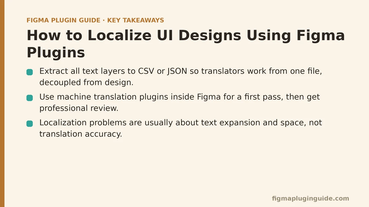
That last detail matters more than it sounds like it should. Localization problems are rarely about translation accuracy — they’re about space. English is a comparatively compact language, and a layout built to fit English text is a layout built to fail once that text is replaced with something longer.
Step One: Extracting Text Without Breaking Layer Structure
The naive approach to translation is opening each text layer, copying the string out, translating it somewhere else, and pasting the result back in. At 140 layers, this is a full day of tedious, error-prone work, and it’s also the point where most localization efforts quietly go over budget.
A text-extraction plugin solves the first half of this problem. Instead of touching layers one at a time, you select the frames you want localized and export every string to a structured format — typically CSV or JSON — with each row tied back to its source layer. Translators, whether human or machine-assisted, then work from that single file rather than from the design tool itself, which keeps translation work decoupled from design work in a way that scales.
For the dashboard, this step took about fifteen minutes and produced a spreadsheet with 140 rows: layer name, frame context, and the English source string. That spreadsheet became the single artifact that everything else in this walkthrough builds on.
Step Two: Machine Translation as a Starting Point, Not an Endpoint
With the extraction done, the next move was running the strings through a translation-integrated plugin that connects to a machine translation API directly inside Figma. This isn’t a substitute for professional review on customer-facing copy, but it’s an efficient way to get a first-pass draft in place, especially for interface labels and short strings where nuance matters less than it does in marketing copy.
Four target languages meant four passes: German, Japanese, Arabic, Brazilian Portuguese. Each pass populated the text layers automatically, matching strings back to their original layers using the same identifiers from the extraction step. No manual pasting. No mismatched layer-to-string mapping. That mapping step is where manual processes tend to introduce errors — a string meant for a button ending up in a tooltip — and it’s exactly the kind of repetitive matching that a plugin handles more reliably than a person copying rows by hand.
What came out the other side wasn’t publication-ready. It was, however, immediately useful for the next step, which is where the real layout problems surface.
Step Three: Watching Text Expansion Break the Sidebar
German was the first language to expose a structural issue. “Settings” became “Einstellungen.” “Export” became “Exportieren.” Individually, these are small differences. Stacked across a sidebar navigation with fixed-width containers, they pushed several labels past their frame boundaries, truncating text that had fit perfectly well in English.
This is the expansion problem every localization guide mentions and almost every design team underestimates anyway. English-to-German expansion averages somewhere around 20-35% depending on the content, and interface labels sit at the higher end of that range because they’re often single compound words in German where English uses two shorter ones.
A layout-testing plugin built for this exact scenario let us swap in placeholder strings of varying lengths — not real German text, but strings calibrated to simulate expansion percentages for different target languages — and see which frames broke before the real translations were even final. This caught the sidebar issue early, along with two modal dialogs where button labels were sitting flush against their container edges with zero tolerance for longer text.
The fix wasn’t clever. It was switching the fixed-width sidebar containers to auto-layout frames with hug-content sizing and a minimum width, so labels could grow without truncating and without the sidebar becoming absurdly wide for shorter languages. Auto-layout isn’t a localization feature specifically, but it’s the single Figma capability that makes multi-language design remotely sustainable, because it removes the need to manually resize every container for every language.
Step Four: Japanese and the Line-Break Problem Nobody Warns You About
Japanese introduced a different issue entirely — not expansion, but line-breaking behavior. Japanese doesn’t use spaces between words the way English does, which means the browser or design tool’s default line-break logic can split a word in an awkward place, or fail to break at natural phrase boundaries at all.
This is a case where a general translation plugin doesn’t help, because the problem isn’t the translation — it’s typographic rendering. A CJK-aware text plugin that respects proper line-break rules for Japanese (and Chinese and Korean, for that matter) fixed the wrapping in the data table headers, which were the worst offenders since they were the narrowest containers in the file.
Font fallback came up here too. The typeface used for the English version didn’t include full Japanese glyph coverage, so several characters rendered as empty boxes until a font-checking plugin flagged the missing glyphs across the file. Swapping in a font with proper CJK support — and doing it through a plugin that could apply the change across every affected text layer at once, rather than hunting down each instance — resolved it in one pass instead of a layer-by-layer scramble.
Step Five: Arabic and the Mirrored Layout
Arabic is where the project stopped being a translation exercise and became a layout exercise. Right-to-left languages don’t just flip the reading direction of text — they flip the entire interface. Navigation that sits on the left in English moves to the right. Icons that imply directionality, like a “forward” arrow, need to point the other way. Padding and alignment that were set with left-to-right assumptions baked in need to invert.
A dedicated RTL-mirroring plugin handles the mechanical part of this: it takes a frame and produces a mirrored version, flipping layout direction, alignment, and positioning while leaving text content untouched for the translation layer to fill in separately. Without this, RTL support means manually rebuilding every frame’s layout logic from scratch, which is slow and genuinely easy to get wrong in small, hard-to-spot ways — a badge that mirrors correctly except for one icon that was placed as a raw image rather than a component instance, and therefore didn’t flip with everything else.
That last detail is worth calling out on its own: mirroring works reliably on properly structured components and auto-layout frames. It works poorly on ad hoc groups and manually positioned elements. Part of what this project surfaced was that a few components in the original file weren’t built cleanly enough to survive automated mirroring, and those had to be rebuilt as proper components before the RTL pass could run correctly. That’s not a plugin limitation so much as a lesson about file hygiene paying dividends later.
Step Six: Brazilian Portuguese and the Quiet Case
Compared to the previous three languages, Brazilian Portuguese was uneventful, and that’s worth mentioning too. Moderate text expansion, standard left-to-right layout, full font glyph coverage with the existing typeface. The auto-layout changes made for the German pass absorbed the expansion without further adjustment, and no RTL mirroring was needed.
This is a useful data point for planning future localization work: not every language demands the same level of intervention. Budgeting equal review time for every target language assumes a uniformity that doesn’t hold up in practice. German and Arabic ate most of the review hours on this project; Portuguese needed a fraction of that.
Step Seven: Reassembling and Reviewing Across All Four Languages
With translations populated and layout issues addressed per language, the final stage was a side-by-side visual review — English source alongside each of the four localized versions, checked frame by frame. This is where a design-review or diffing plugin earns its keep, since it can flag visual differences between versions automatically rather than relying on someone scrolling between four separate pages trying to spot what changed.
The review caught two remaining issues: a status badge in the Japanese version where the auto-layout padding hadn’t been set to hug content, leaving noticeable empty space around short strings, and an Arabic modal where a close icon had been missed during the mirroring pass — the exact ad hoc-element problem mentioned above, having slipped through on a second component the first check hadn’t covered.
Both were quick fixes once flagged. Neither would have been obvious without a structured comparison pass, because each language was reviewed in isolation right up until this final step, and isolated review is precisely how small inconsistencies survive to shipping.
What This Project Suggests About Localization Workflow Generally
A few patterns held up beyond this specific file, and they’re worth carrying into other localization work:
Text extraction and reinsertion plugins remove the most tedious and error-prone part of the process — matching strings back to layers — and that alone justifies their use even on smaller projects than a 140-layer dashboard.
Auto-layout isn’t optional if more than one language is in scope. Fixed-width containers built for English will break somewhere, and it’s rarely the place you’d guess in advance.
RTL support depends on clean component structure more than it depends on any single plugin’s sophistication. Mirroring tools do their job well; they can’t fix layout debt that predates the localization effort.
Review time isn’t uniform across languages. Plan for German and Arabic-style languages to need more scrutiny than something closer to English in structure and reading direction, and allocate accordingly rather than splitting review time evenly by default.
| Stage | Plugin Type | What It Solved |
|---|---|---|
| Text extraction | String export plugin | Removed manual copy-paste across 140 layers |
| Draft translation | Machine translation plugin | Fast first-pass content, tied to layer identifiers |
| Expansion testing | Layout-testing plugin | Surfaced overflow before final translations landed |
| CJK rendering | Line-break and font-check plugins | Fixed wrapping and missing glyph coverage |
| RTL layout | Mirroring plugin | Flipped layout direction and alignment automatically |
| Final QA | Visual diff/review plugin | Caught leftover issues missed in per-language review |
If you’re starting a localization pass of your own, the order above is a reasonable default sequence to follow: extract, draft-translate, stress-test the layout before anything is final, handle script-specific rendering issues, mirror for RTL where needed, and finish with a comparison pass across every version rather than trusting each language’s isolated review. The specific plugins you reach for at each stage matter less than making sure none of these six stages gets skipped. Related guides: How to Organize Large Figma Files Using Plugins, Best Figma Plugins for AI Design Automation, and Best Figma Plugins for Content Population.