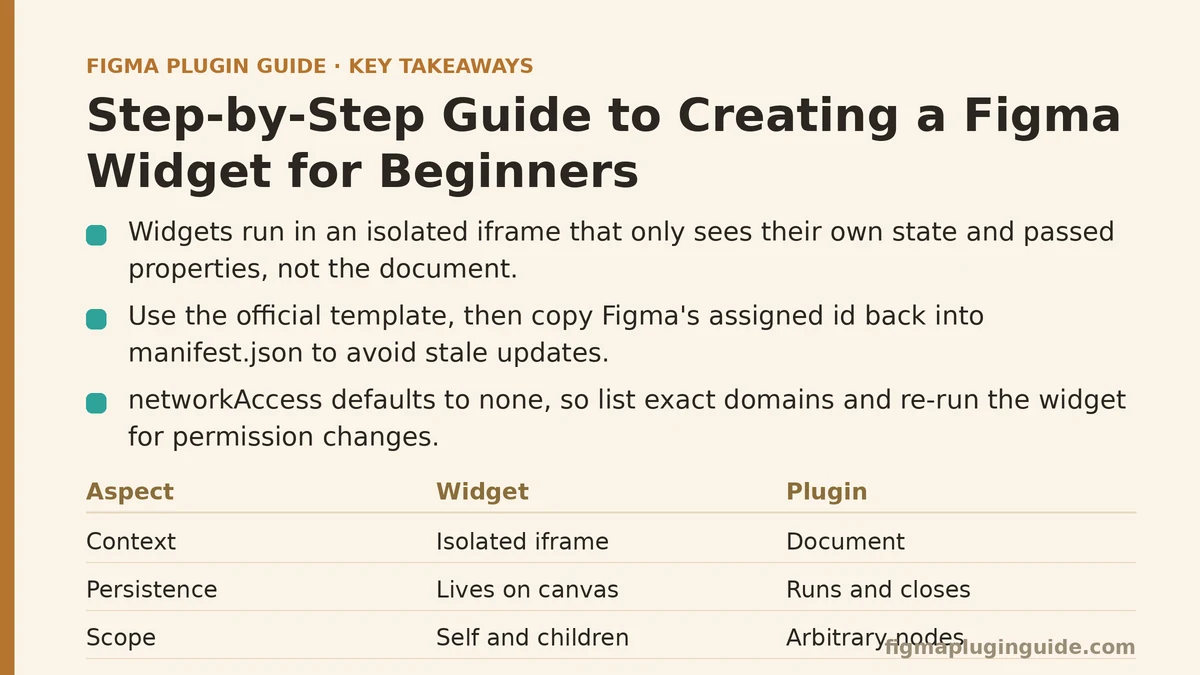
Roughly half of all first Figma widget attempts fail at the same point: the developer writes a UI that renders correctly in the Figma editor preview, then discovers the widget cannot read the property they need because widgets do not run in the document context — they run in an isolated iframe that only sees its own state and the properties passed into it. Understanding that constraint before writing a line of code is the difference between a widget that ships in an afternoon and one that gets abandoned after two days of fighting the API.
This guide walks through building one small but complete widget — a progress bar that displays a percentage — from an empty folder to a published widget inside a Figma file. Everything below is a single case study, not a menu of options, because the fastest way to understand widgets is to build one and watch the boundaries the environment enforces.
What a Widget Is and What It Is Not
A widget is a Figma node that runs JavaScript inside the Figma canvas. It is not a plugin. Plugins run from a menu action, manipulate the document, and close. Widgets persist as objects on the canvas, render their own UI continuously, and can only manipulate themselves and their immediate children — they cannot touch other nodes on the page.
That distinction drives everything else. A widget cannot:
- Iterate the current selection
- Modify other layers
- Call
figma.currentPageand read arbitrary nodes - Use the same
figma.clientStorageisolation a plugin uses
A widget can:
- Render UI using a subset of the Figma plugin API’s node-creation geometry
- Store its own state via
useSyncedStateanduseSyncedMap - Read its own properties via
usePropertyMenu - Respond to user input from its own input elements
If the thing you want to build needs to modify someone else’s design, you want a plugin, not a widget. If it needs to live on the canvas as a self-contained object with its own interactivity, a widget is the right primitive.
Step 1: Scaffold the Project
The fastest way to start is the official template. From an empty directory:
npm create @figma/widget-typings@latest my-progress-widget
cd my-progress-widget
npm install
This produces a project with manifest.json, code.tsx, ui.tsx (optional), package.json, and a tsconfig.json preset for the widget type definitions. The generated manifest.json looks approximately like this:
{
  "name": "Progress Widget",
  "id": "0000000000000000000",
  "api": "1.0.0",
  "main": "dist/code.js",
  "editorType": ["figma", "figjam"],
  "widgetApi": "1.0.0",
  "networkAccess": {
    "allowedDomains": ["none"]
  }
}
Two fields deserve attention before writing any code.
The id field is a placeholder until you run the widget inside Figma. When you first load it as a development widget, Figma assigns a real ID and you must copy it back into the manifest. If the ID is wrong, Figma will refuse to update the widget after the first insertion and you will be stuck with a stale version in the canvas.
The networkAccess field is strict by default. Setting it to "none" blocks all outbound fetch calls. If your widget needs to load an image or hit an API, you must list the exact domains — wildcards are limited — and re-run the widget for the permission change to take effect. A widget that silently fails to load an image is usually a networkAccess misconfiguration, not a code bug.
The editorType array determines which Figma surfaces the widget can be inserted into. Widgets that rely on FigJam-specific properties like figjam node types will not work in Figma Design and vice versa. Leave both entries in only if you have tested both.
Step 2: Write the Smallest Possible Widget
Open code.tsx. Replace its contents with the following:
const { widget } = figma;
const { Text, AutoLayout } = widget;

function ProgressWidget() {
  const [percent, setPercent] = widget.useSyncedState<number>("percent", 50);

  return (
    <AutoLayout
      direction="horizontal"
      spacing={8}
      padding={12}
      cornerRadius={8}
      fill="#F5F5F5"
    >
      <Text fontSize={14} fill="#333333">
        {percent}%
      </Text>
    </AutoLayout>
  );
}

widget.register(ProgressWidget);
Three things make this minimal widget work.
widget.useSyncedState is the state API. The first argument is a stable key, the second is the default value. State persists across reloads, copies, and even when the widget is duplicated — each duplicate gets its own copy of the state. Using React.useState instead will compile but will not persist, and the widget will reset every time the file reopens.
AutoLayout is the widget equivalent of a frame with auto layout. Direct <div> elements do not exist in the widget rendering model; the JSX uses a small set of primitives — AutoLayout, Frame, Text, Rectangle, Ellipse, SVG, Input, Image, Line, Vector — and any nesting must use those.
widget.register must be called exactly once at the bottom of the file. Forget it and the widget simply will not appear in the insert menu, with no visible error.
Step 3: Load It Into Figma and Verify the ID Round-Trip
Building the widget:
npm run build
This runs TypeScript against the widget typings and outputs dist/code.js. Now open Figma, right-click on the canvas, navigate to Plugins → Development → Import widget from manifest, and select the manifest.json file.
On first import, Figma assigns the widget an ID. Copy that ID into the id field of the manifest, rebuild, and re-import. Skipping this step is the single most common reason a widget works once and then refuses to update.
Insert the widget into a Figma Design file — not FigJam, unless you also want to test there. You should see a gray rounded rectangle with “50%” in it.
Verification check: duplicate the widget (Cmd/Ctrl + D). Change the percentage in one — by editing state, which you have not implemented yet — and confirm the other does not change. The state copies are independent, which is the expected behavior of useSyncedState.
Step 4: Add the Property Menu for User Input
The widget is inert. Add a property menu that lets the user pick the percentage:
function ProgressWidget() {
  const [percent, setPercent] = widget.useSyncedState<number>("percent", 50);

  widget.usePropertyMenu(
    [
      {
        itemType: "dropdown",
        propertyName: "preset",
        options: [
          { label: "25%", value: "25" },
          { label: "50%", value: "50" },
          { label: "75%", value: "75" },
          { label: "100%", value: "100" },
        ],
        selectedOption: percent.toString(),
        onSelect: (event) => {
          setPercent(Number(event.propertyValue));
        },
      },
    ],
    []
  );

  return (
    <AutoLayout
      direction="horizontal"
      spacing={0}
      padding={0}
      cornerRadius={8}
      fill="#E5E5E5"
      width={200}
    >
      <AutoLayout
        direction="horizontal"
        width={(200 * percent) / 100}
        fill="#2C7BE5"
        cornerRadius={8}
        padding={0}
      >
        <Text fontSize={12} fill="#FFFFFF" padding={6}>
          {percent}%
        </Text>
      </AutoLayout>
    </AutoLayout>
  );
}
Two API notes that matter here. The second argument to usePropertyMenu is a dependency array — passing a stale value means the menu will render with outdated option selections. The onSelect handler runs in the widget context and can call setPercent directly.
The other note: width on the inner AutoLayout is a number, not a string. Passing "50%" will not compile because widget geometry does not accept relative units. Every dimension is a pixel value you compute yourself.
Step 5: Handle the Failure Modes That Consume the Most Time
The following four issues account for the majority of time lost by first-time widget developers, based on the volume of questions they generate in the widget community.
Failure mode one: “Property ‘X’ does not exist on type ‘WidgetNode’.” This is almost always a stale typings package. The widget API evolved, and @figma/widget-typings must match the widgetApi version in your manifest — currently 1.0.0. Run npm update @figma/widget-typings and rebuild.
Failure mode two: the widget renders blank with no error. In practice, this is usually a missing widget.register call, an unclosed JSX tag that the TypeScript compiler accepted because of a syntax edge case, or a bad fill color. Colors must be hex strings like "#FF0000" or the literal "transparent" — RGB objects and CSS color names such as "red" do not work.
Failure mode three: state resets when the file reopens. The state was stored with React.useState instead of widget.useSyncedState. The two look identical in code but behave completely differently. There is no error message; the widget simply forgets everything.
Failure mode four: the widget loads in FigJam but not in Figma Design. The editorType array in the manifest is probably missing "figma". Conversely, relying on figjam-only node types like connectors will crash the widget inside Figma Design with an unhelpful error.
Each of these four issues produces a visible but confusing symptom. Before changing any code, check the manifest first.
Step 6: Publish to the Figma Community
Publishing a widget and publishing a plugin use the same workflow, but the review criteria differ. Widgets are evaluated more strictly on visual fit within the Figma canvas — a widget that visually clashes with surrounding frames is more likely to receive revision requests.
The publish dialog requires a name, description, tagline, icon (a 128x128 PNG with no transparency), and at least one screenshot showing the widget in use. The id field in the manifest must already be the real Figma-assigned ID from step 3.
Before publishing, review these three items:
- Set
networkAccessto the minimum. If your widget never fetches anything, keep it at"none". Reviewers scrutinize network permissions. - Test the widget’s behavior after duplication and copy-paste. Synced state copies with the widget, and files that rely on cross-widget state (via
useSyncedMap) will break subtly if the user copies them into a different file. - Confirm
editorType. Submitting a FigJam-only widget with"figma"listed will produce an immediate rejection during review.
Once submitted, widgets enter a review queue that typically resolves within a few business days. Rejected submissions come back with a specific reason, and re-submitting with a fix is a normal part of the process.
When a Widget Is the Wrong Choice
Widgets have a specific shape: they live on the canvas, they hold their own state, and they render their own UI. If the problem you are solving falls outside that shape, a plugin will usually be simpler and more powerful.
Three signals that you should build a plugin instead:
- The tool needs to inspect or modify nodes the user has selected. Widgets cannot see the selection.
- The tool is a one-shot transformation — exporting something, renaming layers, applying a style. There is no reason to persist it as a canvas object.
- The tool needs to run automatically on a document event. Widgets render when in view; they are not an event system.
A useful rule: if the user would insert it and then periodically interact with it, a widget. If the user would run it and then close it, a plugin.
Recap of the Working Pipeline
| Step | Command or Action | Expected Result |
|---|---|---|
| Scaffold | npm create @figma/widget-typings@latest | Project with manifest and starter code |
| Build | npm run build | dist/code.js produced with no TypeScript errors |
| Import | Import widget from manifest in Figma | Widget appears in the insert menu |
| Fix the ID | Copy Figma-assigned ID into manifest | Subsequent builds update the existing widget |
| Insert and verify | Insert in Figma Design | A rounded rectangle appears on canvas |
| Add interaction | usePropertyMenu + useSyncedState | User can change the percentage from the menu |
| Publish | Community publish dialog | Submission enters the review queue |
The order matters. Reading the manifest before writing code, verifying the ID round-trip before adding features, and testing the duplication behavior before publishing will each save a measurable amount of time compared to discovering the same problems after submission.
Related guides: Step-by-Step Guide to Building a Figma Plugin for Generating Color Palettes, Step-by-Step Guide to Building a Color Contrast Checker Figma Plugin for Beginners, and How to Monetize Your Figma Plugin: A Step-by-Step Guide.